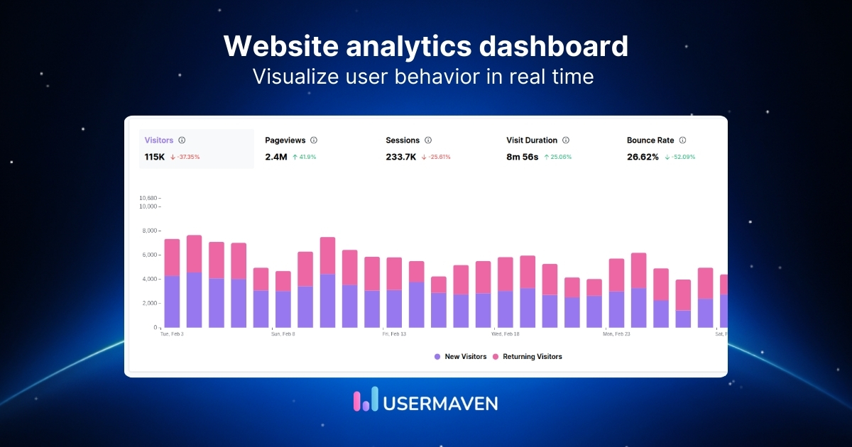
You’re not just building a dashboard for reporting. You’re building it so someone can open it for 30 seconds and know what to pay attention to.
A solid web analytics dashboard answers three questions fast: what changed, where it came from, and what it did to conversions. Everything else is a drill-down.
It should feel calm and dependable. Clean layout, consistent website metrics, and just enough context to make trends obvious without a meeting.
In this guide, we’ll break down what to include in a web analytics dashboard, share a few example layouts, and show how to set one up so it stays useful over time.
What is a web analytics dashboard?
A web analytics dashboard is a single, visual view of how people find your site, what they do once they arrive, and what converts. It brings the numbers into one place, so performance is easy to read at a glance.
Most dashboards track a small set of core metrics that stay consistent over time:
- Sessions and pageviews
- Events and conversions
- Revenue analytics and pipeline data
Instead of digging through endless menus, a website analytics dashboard keeps the focus on the questions that matter. How many visitors you’re getting, where they’re coming from, which pages hold attention, and which actions turn visits into leads or customers.
Think of it as the control panel for your website analytics strategy. It pulls scattered web analytics reports into a single source of truth that surfaces trends, flags issues early, and links website activity to outcomes such as pipeline and revenue.
What does an effective web analytics dashboard look like?
An effective dashboard makes website analytics easy to understand and hard to misread.
Here are the key characteristics to look for:
- Centralized website data that pulls key metrics into one place, so you’re not bouncing between tools or tabs.
- Goal-focused layout that prioritizes outcomes like signups, demos, and revenue over vanity metrics like raw pageviews alone.
- Flexible views so different teams can filter by channel, campaign, page, segment, or date range without rebuilding reports.
- Real-time visibility that updates fast enough to catch traffic shifts, broken pages, or campaign spikes while they’re happening.
- Actionable insight that shows trends and context, not just numbers, so you know what changed and where to dig in.
- Visually clean design with clear hierarchy, minimal clutter, and consistent definitions, so the same metric always means the same thing.
Why are unified web analytics dashboards important?
If you want web analytics to drive action, the data can’t live in five different places.
Here’s what a unified dashboard actually gives you:
- A single, trusted view of performance so teams stop reconciling numbers and start making decisions.
- Instant context behind spikes and dips so you can see what changed, where it came from, and what it affected.
- Self-serve answers for every stakeholder, so web analytics reports don’t turn into a weekly bottleneck.
- A clearer path from traffic to conversion so you can connect channels, pages, and actions without stitching data together.
- Faster cross-team alignment because marketing, product, and leadership are looking at the same story.
- Earlier detection of tracking and funnel issues, so broken events, traffic drops, and conversion leaks stand out quickly.
[web_analytics]
Types of web analytics dashboards
Not every dashboard is built for the same job. Here’s a simple way to compare the three most common types.
| Dashboard type | Who it’s for | What it’s used for | What it typically shows |
|---|---|---|---|
| Strategic | Leadership, founders, heads of growth | Tracking business performance over time | North-star KPIs, conversion rate, revenue/pipeline impact, channel mix, trend lines |
| Operational | Marketing teams, lifecycle, web managers | Daily monitoring and quick reaction | Live traffic, campaign performance, top pages, alerts for spikes/drops, form errors, key funnel steps |
| Analytical | Growth analysts, product/marketing ops | Investigating “why” behind results | Segments, cohorts, session duration, conversion breakdowns, drop-off, and multi-touch attribution |
Key metrics to track in your web analytics dashboard
A dashboard is only as useful as the metrics you put on it. Let’s break that down into the core metric groups your dashboard should cover.
Audience and traffic metrics
Start with who’s showing up and where they’re coming from. The goal is to understand traffic quality, because “more traffic” isn’t a win if it’s the wrong traffic.
- Users and sessions: A quick read on overall demand, with a simple trend to spot spikes and dips.
- Traffic by channel and campaign: Performance by source using UTM tracking, so you know what’s actually driving visits.
- Top landing pages: Pages bringing in the most sessions and how well they convert once people arrive.
- Locations and languages: Where visitors are based and what they prefer, so you can confirm audience fit.
- Devices and browsers: How people access your site, helping you catch UX issues early.
Related: How to check traffic on any site
Engagement metrics
Next, measure whether visitors are doing anything meaningful. Engagement metrics should tell you whether content is holding attention and whether people are taking high-intent actions.
- Bounce rate: The share of visits that leave after one page, which can signal mismatched intent or weak landing-page fit.
- Scroll depth: How far people scroll on a page, which helps you judge whether content is actually being consumed.
- Average time on page: A quick read on attention, especially when compared across key pages like blog posts and landing pages.
- Sessions per user: How often individual users return to your site, which helps distinguish one-time visitors from repeat, engaged readers.
- Key events: Actions such as CTA clicks, video plays, and pricing page views that indicate intent beyond just reading.
- Top pages by engagement: Pages that keep users active, not just pages that get the most visits.
Conversion and revenue metrics
Conversion and revenue metrics are the part that keeps your dashboard honest. Define your conversion goals clearly, then track how often they happen and where they drop off.
- Conversion rate by goal: The percentage of visits that complete each conversion goal, like signup, demo request, trial start, or purchase.
- Funnel drop-off: The step where visitors abandon the flow, so you can prioritize fixes that lift conversions.
- Conversions by channel and campaign: Which sources drive results when your UTM tracking is consistent.
- Lead source tracking: Which channels and campaigns are generating form submits or demo requests that matter.
- Revenue attribution: How sessions connect to downstream outcomes when you can tie analytics to CRM or revenue data.
Retention metrics
Retention metrics indicate whether your site attracts repeat visitors or primarily attracts visitors who never return. It’s also the quickest way to spot whether content and campaigns are building momentum.
- New vs. returning visitors: The mix of first-time and repeat visitors, tracked over time to spot retention shifts.
- Return rate by channel: Which sources bring people back, not just bring them once.
- Repeat conversions: Whether visitors convert again during longer buying cycles, such as multiple demo touches or repeat signups.
- Cohorts by first visit date: How return behavior changes for different signup periods, so trends are easier to compare.
Related: KPI dashboards
Essential reports every web analytics dashboard needs
Here are the core reports that keep your dashboard useful week after week.
Acquisition report
When something shifts, this is the first place you look. It shows which channels moved and whether that change came from search, paid, social, email, or referrals.
In an online analytics dashboard, it should go beyond volume and show quality. The point is to see which sources bring visitors who reach high-intent pages and complete goals, not just inflate sessions.
Content and page performance report
This report shows what your site is doing once people land. Which pages earn attention, which pages lose it fast, and which pages quietly drive outcomes.
When you’re tracking user behaviour across key pages, this report makes the pattern obvious. You can see where visitors spend time, where they drop off, and which paths tend to lead to conversions.
Attribution report
Marketing attribution is how you avoid giving all credit to the last click. It helps you understand which channels and pages assist conversions, not just which one “finished” them.
For enterprise web analytics, this matters even more because journeys are longer and touchpoints stack up. A good attribution view, supported by marketing attribution software, makes those assist patterns obvious, so you can invest in what’s actually influencing outcomes.
Related: How to build a marketing attribution dashboard
Funnel report
Funnels are where web analytics becomes concrete. You can see exactly where visitors drop, which step is leaking, and how big the leak is.
A strong funnel report turns tracking user behaviour into something actionable. If conversion drops, you can quickly tell whether it’s due to traffic quality, a page-level UX problem, or a single step that needs fixing.
Conversion goals report
This report is the scoreboard. It keeps your conversion goals visible and makes it obvious when performance shifts, even if traffic looks steady.
The best version ties goals back to sources and pages inside your site analytics dashboard. That way, you can see what’s driving results and what’s just driving activity.
Audience and device report
Web analytics changes depending on context. This report shows whether performance holds across devices, browsers, and locations, or whether one segment is quietly dragging results down.
It’s where many improving user experience wins come from, especially on mobile. When tracking user behaviour by device, you can catch issues like layout breaks or form friction early, while fixes are still cheap.
Web analytics dashboards examples
Let’s look at a few common dashboard setups and the questions they’re built to answer.
CMO dashboard
A CMO dashboard is built for the big picture. It gives marketing leadership a quick read on how channels, campaigns, and site performance contribute to growth.
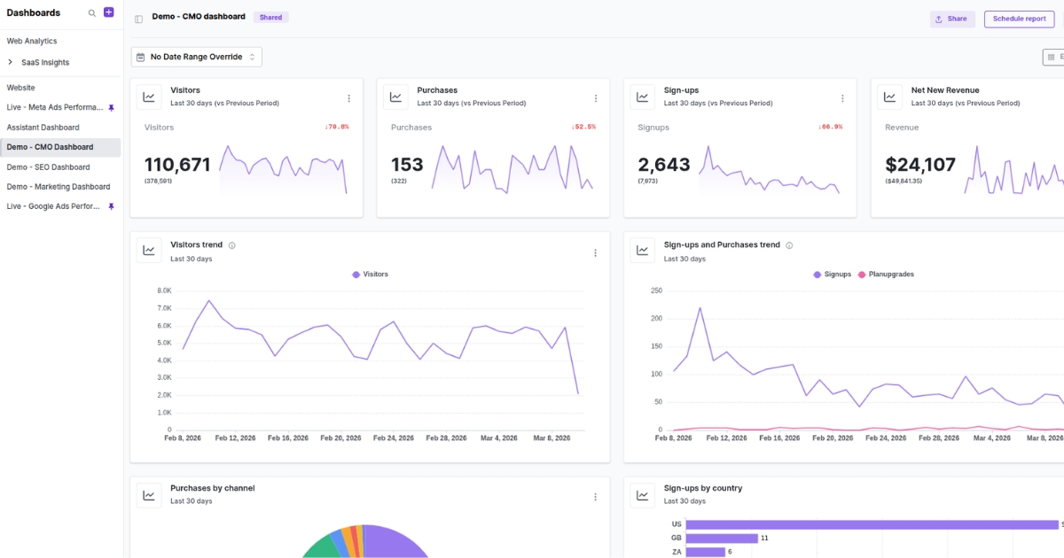
This dashboard should bring top-level KPIs into a single, clean view, so you can spot momentum, weak points, and performance shifts without digging through multiple reports.
It helps you answer:
- Are marketing efforts driving meaningful growth?
- Which channels are contributing most to pipeline, signups, or revenue?
- Are conversion trends improving or starting to flatten?
- How is the overall website performance supporting broader marketing goals?
SEO analytics dashboard
An SEO analytics dashboard helps you understand whether search visibility is turning into qualified traffic and real business outcomes.
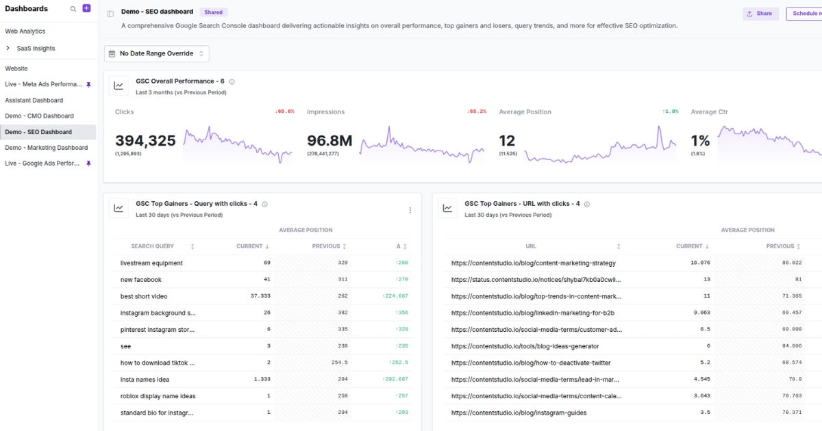
It should connect your SEO KPIs with on-site behavior, so you are not just watching rankings move in isolation. Traffic matters, but what happens after the click matters more.
It helps you answer:
- Which pages are bringing in organic traffic?
- Are high-ranking pages attracting the right visitors?
- Which landing pages drive engagement, and which lose people quickly?
- Where are organic visitors converting, and where are they dropping off?
- Which content opportunities are worth updating, expanding, or reworking?
User behaviour dashboard
A user behaviour dashboard shows how people move through your site once they arrive. This is where you stop looking at traffic as a volume metric and start looking at it as a journey.
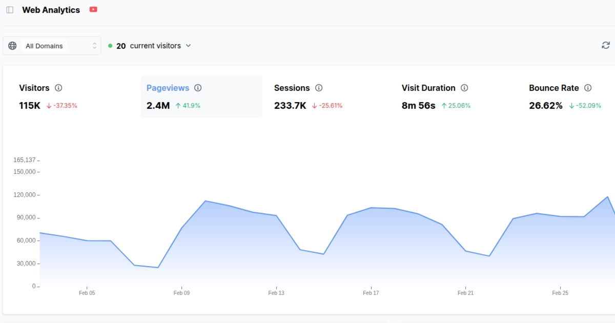
It helps you uncover friction, hesitation, and intent. That makes it one of the most useful dashboard views for improving conversion paths and page performance.
It helps you answer:
- Which pages keep users engaged?
- Where are visitors dropping off in key journeys?
- How far are users scrolling or navigating before leaving?
- Which paths lead to conversions most often?
- Where does user intent seem strong, but the experience breaks down?
Paid ads dashboard
A paid ads dashboard helps you tie campaign spend to actual website performance. It keeps reporting grounded in outcomes, using paid ads analytics to connect clicks to what happens after the landing.
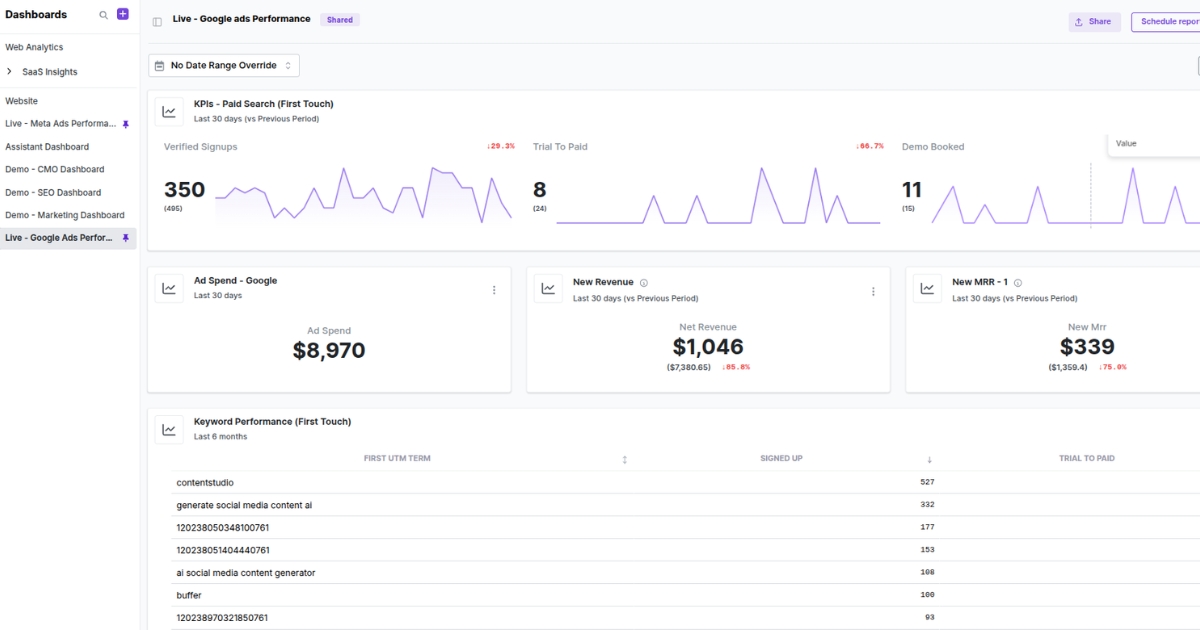
That matters because strong ad clicks do not always translate into strong on-site results. This dashboard helps you separate traffic that looks good from traffic that performs well.
It helps you answer:
- Which campaigns are driving qualified visits?
- How is paid traffic converting once it reaches the site?
- Which channels or ad sets are producing the best return?
- Are landing pages supporting paid traffic effectively?
Ecommerce dashboard
An ecommerce dashboard is focused on revenue flow. It helps you see how shoppers move from discovery to purchase and where that process starts to weaken.
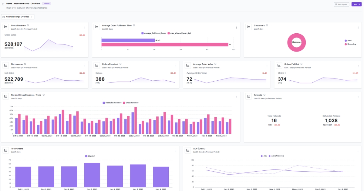
It also keeps the story tied to outcomes by pairing journey signals with core ecommerce KPIs, so you can spot what’s changing and why.
It helps you answer:
- Which products or categories attract the most attention?
- Where are shoppers abandoning the buying journey?
- Is the site converting product interest into actual sales?
- How are revenue, conversion rate, and average order value trending?
- Which parts of the funnel need attention first?
Content marketing dashboard
A content marketing dashboard helps you measure whether content is simply attracting visits or actually supporting business goals.
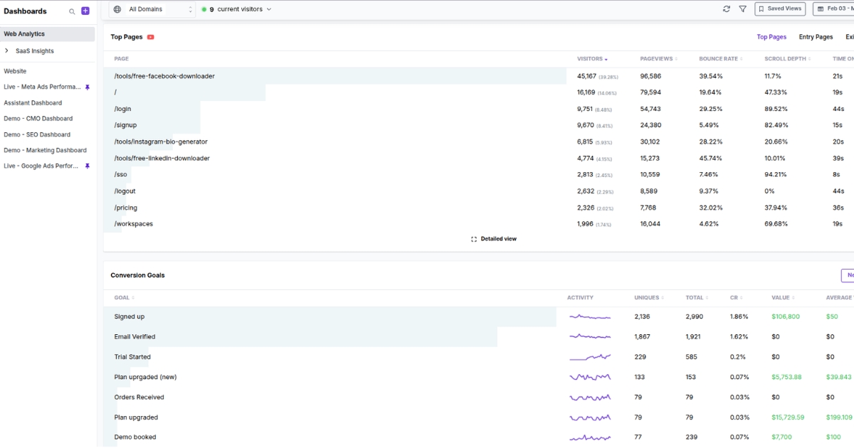
This is where you evaluate content with more context. A pageview spike may look good, but it means very little if visitors leave without engaging further.
It helps you answer:
- Which content pieces bring in consistent traffic?
- What content keeps people reading and exploring?
- Which articles assist conversions or lead generation?
- Where is content attracting low-intent visits?
Audience segmentation dashboard
An audience segmentation dashboard helps you understand who is visiting your site and how different audience groups behave.
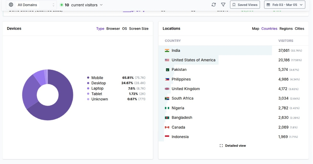
When you combine demographic or firmographic data with engagement and conversion trends, the dashboard becomes much more actionable. You stop viewing audiences as static groups and start identifying which segments actually matter.
It helps you answer:
- Which audience segments engage more deeply?
- Are certain regions, devices, or customer groups converting better than others?
- How does behavior vary across different audience types?
Also read: Top 15 analytics dashboard examples
How to build an effective web analytics dashboard
A dashboard should help you make sense of performance fast. Here’s a simple step-by-step guide to building one that stays useful.
1. Start with one clear goal
Before you choose metrics, decide what the dashboard is supposed to do.
Is it meant to track website visitors, monitor campaign performance, measure conversions, or surface user behavior?
Pick one primary purpose first. That keeps the dashboard focused and prevents it from trying to cover everything at once.
2. Build it for a specific audience
Different teams need different answers.
A marketing lead wants channel performance and conversion trends. An SEO team wants landing page visibility and search performance. A growth team wants behavior signals and funnel movement.
The more specific the audience, the more useful the dashboard becomes.
3. Choose only the metrics that matter
This is where discipline matters most.
An effective dashboard does not try to include everything. It pulls in the few metrics that make performance easier to understand. In most cases, that means a focused mix of visibility, engagement, and outcome metrics.
Keep it simple: if a metric doesn’t help someone decide what to do next, it doesn’t belong on the analytics dashboard.
4. Organize the view from top to bottom
Good dashboards are easy to scan.
Put your most important KPIs first. Follow those with supporting charts or breakdowns. Then add detail for anyone who needs to look deeper. That way, someone can understand the headline story in seconds before moving into the why.
A clean structure usually looks like this:
- top-line KPIs
- trend or comparison charts
- channel, page, or segment breakdowns
5. Make trends and changes obvious
A number on its own does not say much. What matters is movement. I
Is traffic growing? Is conversion rate slipping? Is one channel outperforming the rest? Your dashboard should make changes easy to spot without forcing someone to dig through raw data.
That means showing metrics in context. Trends, comparisons, and period-over-period movement are what turn a static report into something useful.
6. Keep refining it over time
The first version should not be the final version. A dashboard needs to stay aligned with how the business works.
Priorities change. Teams ask new questions. Some charts stop being useful. Others become more important. Review the dashboard often and remove anything that adds clutter without adding clarity.
DIY dashboards vs. analytics platforms
There are two common ways to build a web analytics dashboard.
You can build one yourself using spreadsheets and manual reporting, or use an analytics platform with built-in dashboards.
Both approaches can work. The difference usually lies in how much time they take, how reliable they are, and how easily they scale as reporting needs grow.
| Area | Analytics platforms with ready-to-use dashboards | DIY dashboards using spreadsheets |
|---|---|---|
| Setup | Faster to launch with pre-built dashboard views | Flexible, but built manually from scratch |
| Data collection | Pulls data in automatically from connected sources | Often depends on exports and manual updates |
| Accuracy | More reliable once tracking is set up correctly | More room for errors, broken formulas, or outdated reports |
| Speed | Faster access to live or near real-time performance | Slower to update and review regularly |
| Visualization | Comes with cleaner built-in visual reporting | Depends on how much time you spend building charts |
| Scalability | Easier to expand as reporting needs become more complex | Harder to maintain as teams, channels, and metrics grow |
| Collaboration | Better for shared access across teams | Can work, but often leads to version control issues |
| Best fit | Teams that need ongoing visibility and faster decisions | Smaller teams with simple reporting needs |
How Usermaven is built for modern web analytics dashboards
Usermaven is an AI-powered analytics and attribution platform built for teams that want a clearer way to monitor website performance. Instead of forcing you to piece together insights from scattered reports, it helps bring your most important dashboard views into one place.
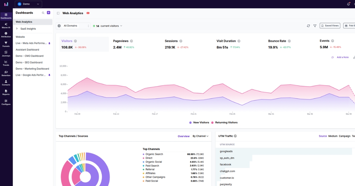
For teams trying to build dashboards that are both flexible and easy to use, Usermaven is designed around that balance. It gives you the structure to track what matters without turning the dashboard into a cluttered reporting layer.
Here’s what you get with Usermaven:
- Custom dashboard building so teams can create views around their own goals instead of relying only on fixed reports.
- Pre-built dashboard templates for use cases like web analytics, SaaS insights, WooCommerce, and Google Search Console, which help teams get started faster.
- Real-time dashboard updates so metrics refresh automatically, allowing teams to monitor changes without waiting for manual reporting cycles.
- Flexible customization options include drag-and-drop editing, adjustable card sizes, grouped metrics, and multiple visualization styles.
- Interactive visualizations that support trend analysis, time-period comparisons, and performance breakdowns across different dimensions.
- Role-specific dashboard views for marketing, product, leadership, or agency teams, making dashboards easier to share and act on across the business.
- Attribution is built into the dashboard ecosystem, which is especially useful when teams want website analytics dashboards to connect traffic and engagement with conversion-driving channels.
Conclusion
A web analytics dashboard should feel like a clear control panel. You open it and instantly see what’s up, what’s down, and what needs your attention.
Usermaven helps you get there as a powerful website analytics tool that keeps your key metrics, journeys, and conversions in one clean view. It cuts the back-and-forth between reports and eliminates the need to rebuild the same charts, so your dashboard stays readable as your tracking grows.
Want a dashboard that makes the next move obvious? Start a free trial or book a demo, and we’ll walk you through it.
Leave a Reply